Visualising ADS-B Flight Data with QGIS and Leaflet
Most modern aircraft use a system called ADS-B (Automatic Dependent Surveillance-Broadcast) to transmit their location, speed and altitude while in flight. These transmissions can be picked up using a SDR receiver.
The Opensky Network is a network of ADS-B receivers around the world. Each month they release a 24 hour extract of their network data.
Processing 75 million Records
Back in July 2018, I downloaded a complete day's worth of data, 24 hourly CSV files in total. Uncompressed it was 7GB of text data and contained 75 million records.
I merged the files into a single CSV and imported them into PostgreSQL (PostGIS). This spatial database could then be visualised in QGIS.
Studying the data in QGIS revealed some additional processing steps I could take.
- Resample from 10-second intervals to 1-minute intervals.
- Interpolate the plane's position when they go out of coverage range.
I wrote a script to perform the resampling. This reduced each flight down to a maximum of 1440 points.
The next step was to find gaps where a plane had left receiver range and then reappeared at a later time. For each gap, I used GeographicLib to create a great circle arc between the last and the next position. I then sampled this curve to find the position for each missing minute interval.
The final issue that I needed to solve was crossing the 180th meridian. Usually, I would use the QGIS "Points to Path" tool to create my lines. An issue arises when a flight crossed the antimeridian, as it would incorrectly draw a straight line from one side of the world to the other.
To solve this problem, I added an additional check in my processing script. I calculate the distance between the previous longitude and the next longitude. If the distance was greater than 340 then it must have crossed. In QGIS I was grouping the flights by their ICAO code so in order to split the flight I added "_1" to the ICAO of any record after I detected the jump which had the affect of splitting the flight into 2 lines.
Once I had loaded the processed data back into QGIS, the "Points to Path" tool now worked correctly. I set the order of the points in the path to be the UTC timestamp field.
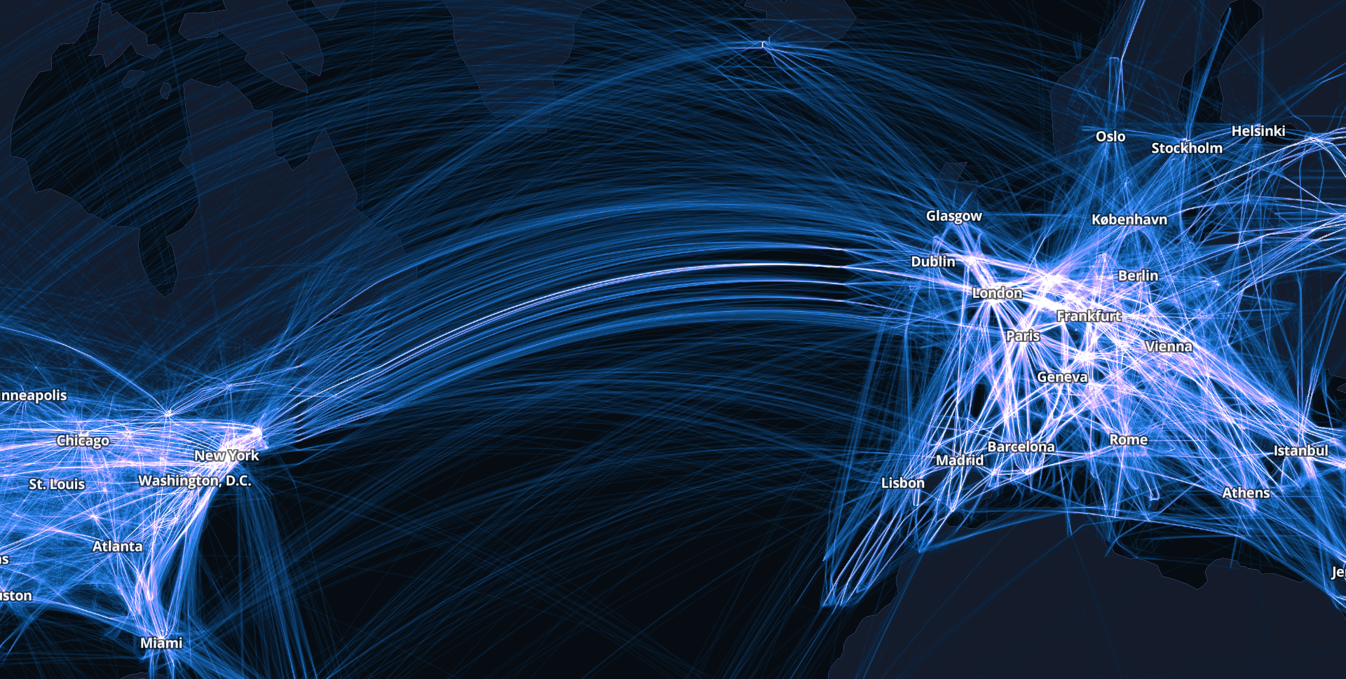
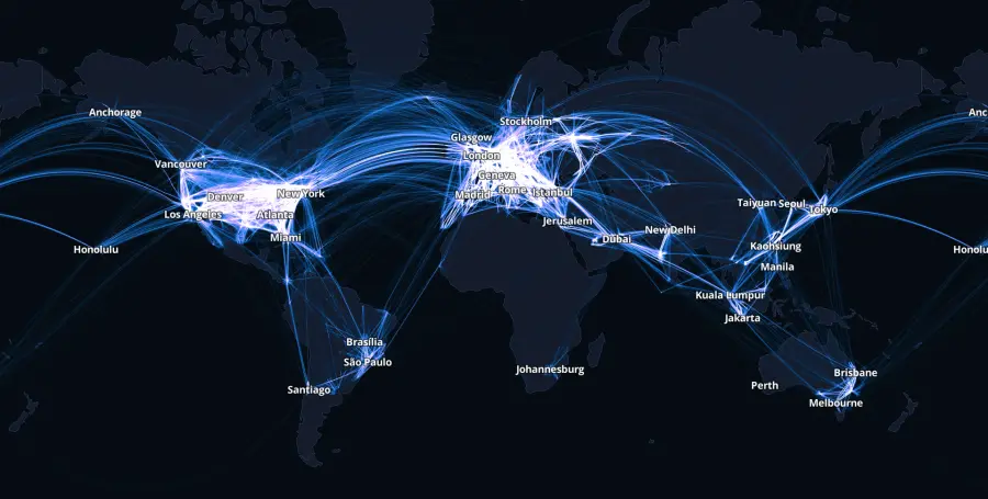
I gave each path a small amount of thickness and had the feature blend mode set to additive. This resulted in the areas with the most flights being the brightest.

Web Mapping with Leaflet.js
Once I was happy with the way the map looked, I rendered it out to "XYZ Web Tiles". To reduce bandwidth, I only rendered out the lines which I set to be transparent pngs. I could add a country outlines basemap later with a GeoJSON file.
Unfortunately, QGIS will generate map tiles even if the tile itself is empty. To save from uploading a large amount of empty files, I used Imagemagick in a shell script to delete any image that had an empty alpha channel.
I used Leaflet.js as the web mapping library. Adding the CSS property filter:hue-rotate() to the tiles would enable the viewer to dynamically color the lines.
Click here or on the image below to view the map.
QGIS Animation
I also used QGIS temporal controller to create an animation of the flights over Taiwan.